I've had a lot of people ask me if we were redoing the Farm room for the baby room and the answer is NO!! It is my favorite room of the house and there is noooo way that I'm clearing it out for the baby room after just 6 months of having it finished. The truth is, we have a three bedroom house and I have just never shown you the third room because I was never happy with how it turned out.
So here are the phases so far of what Solomon's room is looking like...
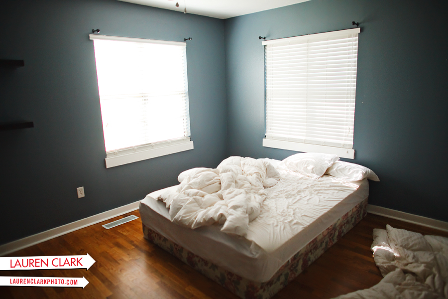
After we sold our bedroom furniture (yes, I know, it looks like a college boy's room)

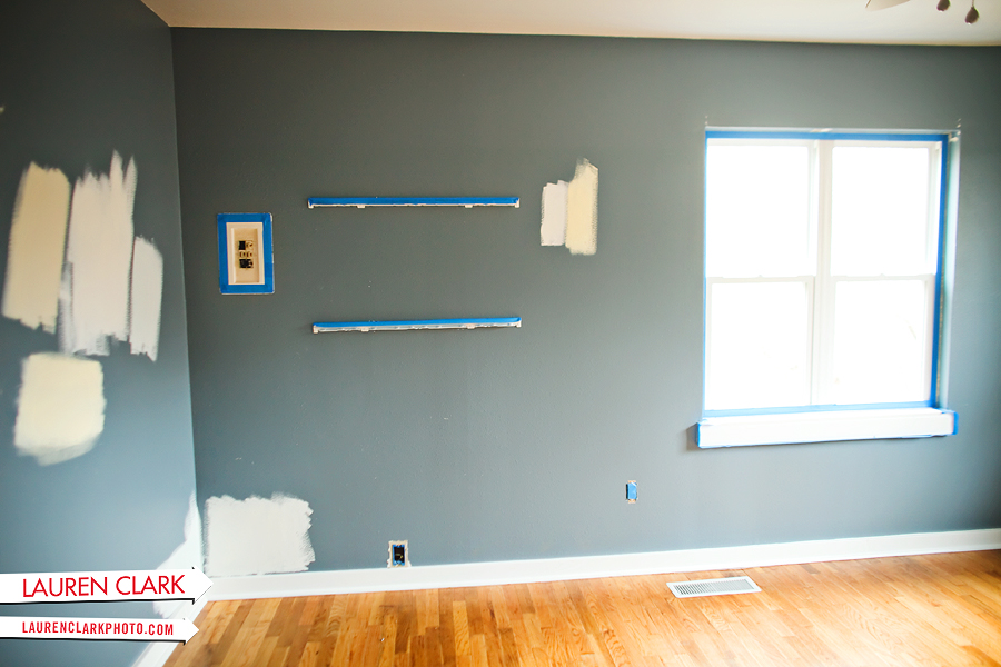
Picking the paint color... we went with the most neutral color I've ever worked with: Valspar's Crafted White (I kind of regret going so neutral, but what can you do?)

Phase 1:


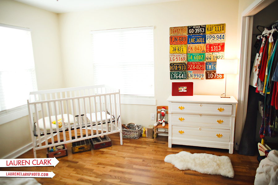
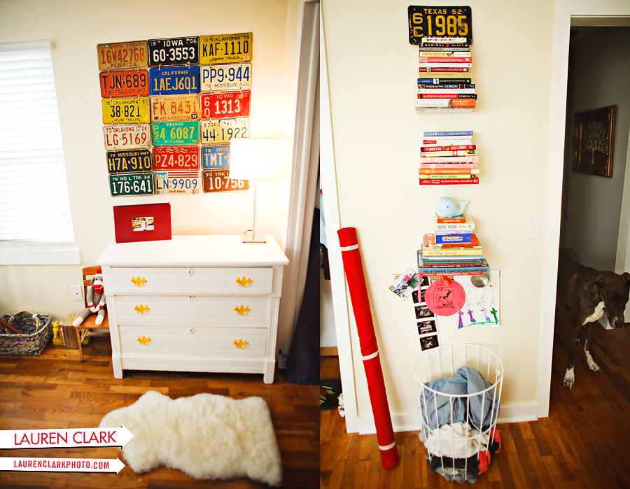
I bought a bunch of colorful license plates from a junk store in Perkins and got them all for about $30! I tied them together with jute twine and hung them with nails to make a colorful piece. I painted the dresser white thinking that the room was going to be a darker color and might end up painting it blue if it still looks too bland. The bolt of fabric on the floor is going to be the curtain color and should really add some nice contrast to the room. We were planning on painting the opposite wall with chalkboard paint and when we read the reviews on the paint and how many coats you had to add we have decided to postpone that idea for a while. I am going to just add floating shelves and storage.
I still have the baby bedding and curtains to add, huge frames, possible colored headboard, baby mobile, larger sheepskin rug in front of the crib, vinyl decals on the ceiling and a few black and white zig zag pillows before it is complete! Can't wait to see how it turns out in the end!
I like the neutral color.....it makes everything else stand out. LOVE the license plates :)
(03.22.11 @ 11:55 AM)I like the paint color, but I'm a fan of neutral. I'm sure the final product will be stunning. I've been thinking of making my own mobile now... I have so many ideas floating around my head that I had never even considered before. Thanks for challenging me to think outside of the box!
(03.22.11 @ 12:09 PM)It looks GREAT! But you are right...this specific neutral color doesn't really scream "Lauren" but I still think its gonna be good once you keep bringing in the other colors you are talking about with the curtains, bedding and an accent chalk board wall. I seriously can't wait to see little Solomon!
(03.22.11 @ 04:05 PM)I just painted my kitchen Crafted White. It's such a nice soft color.
(03.25.11 @ 06:22 PM)WE just did a chalk board wall and it turned out so wonderfully. I can't say enough about it! It actually wasn't too bad, only took two coats and ended up costing just under $30, now i wish i'd of added the magnet paint to it (they mix it in) and they can actually tint the chalkboard paint so it can be moonstone gray (which we did) OR lots of other shades of blue, yellow, etc. Some of the fun "comic book shapes" (think the bam or pow type of shapes) may be fun as well and they have those chalkboard shapes (like you' use for a crazy/photo booth) on etsy.
(03.29.11 @ 09:56 AM)So what room is your office?
(03.29.11 @ 01:09 PM)The license plates are such a genius idea!
(04.18.11 @ 04:33 PM)great post. I love the very unique, creative ideas for the room. Really nice job! More important than the color scheme itself is that you can tell you put a lot of thought into the interior design.
(11.16.11 @ 02:50 PM)license plates are unique. Walls look much better then the blue color for sure. its always best to have light colors on your walls it makes the place look brighter and happier
(01.26.12 @ 04:17 PM)What a huge transformation. I have a client about to brighten up his color palette in his apartment and will send him this link to show what a difference a brighter paint can make.
(07.23.12 @ 03:59 PM)